Mitä myyjän mainoskelpoinen laskeutumissivu tarvitsee konversioiden kasvattamiseksi?
Käytät päivittäin useita tuhansia euroja Facebook-mainontaan. Klikkauksia tulee, mutta tilauksia ei näy. Asiakkaat vierailevat sivulla, selaavat muutaman sekunnin ja poistuvat. Ongelma ei ole mainoksissa – ongelma on sivulla, jonne ohjaat asiakkaat.
Laskeutumissivu – eli mainonnan kohdesivu – on se, joka ratkaisee, tuottaako mainosraha tulosta vai ei. Hyvä kohdesivu voi muuttaa viidestä sadasta klikkaajasta asiakkaan. Huono kohdesivu tuo sadasta klikkauksesta vain yhden epämääräisen liidin.
Mitä siis myyjän mainoskelpoinen laskeutumissivu tarvitsee? Tämä artikkeli käy läpi sivun jokaisen osan – ensimmäisestä otsikkorivistä viimeiseen painikkeeseen – jotta tiedät tarkalleen, mitä sinun on tehtävä, jos haluat todella kasvattaa konversioita.
Ensimmäiset 5 sekuntia: Hero-osio ratkaisee kaiken
Kun henkilö klikkaa mainostasi, hänellä on odotus. Hän haluaa nähdä kohdesivulla täsmälleen sen, mitä mainoksessa luvattiin. Jos hän ei ensimmäisten 5 sekunnin aikana tunnista olevansa oikeassa paikassa, hän painaa paluunappia.
Tästä syystä hero-osio – ensimmäinen näytöllä näkyvä osa – on tärkeämpi kuin mikään muu osa sivua.
Tehokas hero-osio vaatii kolme asiaa:
- Otsikko, joka kertoo hyödyn
- Lyhyt alateksti, joka selittää
- Selkeä toimintakehotuspainike (CTA)
Otsikon ei tarvitse olla kaunis, sen on oltava oikea. Älä kirjoita "Kattava myyntiratkaisu", se on liian yleistä, kuka tahansa voi sanoa sen. Kirjoita tarkemmin:
"Kasvata mainosten tilauksia kolminkertaisesti ilman budjetin nostoa"
On olemassa sääntö nimeltä message match: laskeutumissivun sisällön on vastattava ohjaavaa mainosta. Jos mainoksessa sanotaan "Puolita liidien kustannukset", kohdesivun tulee myös puhua liidien kustannusten pienentämisestä.
Ja älä unohda: hero-osiossa tulisi olla CTA-painike heti yläpuolella. Noin 5–10 % kävijöistä on valmiita toimimaan heti alusta alkaen.
Arvon esittely: Kerro asiakkaalle, mitä hän saa
Hero-osion jälkeen asiakas kysyy itseltään: "Mitä tämä tarkalleen ottaen auttaa minua tekemään?"
Tässä kohtaa sinun on selkeästi esitettävä arvo. Älä aloita ominaisuuksista, vaan aloita kipupisteistä.
Myyjät, jotka mainostavat, kohtaavat usein:
- Asiakkaat tulevat ja poistuvat
- Liikenteen lähdettä ei voi mitata
- Lomake on liian pitkä → keskeytetään
- Liidejä on, mutta niitä ei hoideta → liidit jäähtyvät
Kun puhut oikeista kipupisteistä, asiakas nyökkää.
Sen jälkeen esitä vastaava ratkaisu:
| Ongelma | Ratkaisu |
|---|---|
| Asiakkaat poistuvat | Mobiilioptimoidut laskeutumissivut |
| Tehokkuutta ei voi mitata | UTM-seuranta + reaaliaikainen dashboard |
| Pitkä lomake | Älykäs lomake, joka näyttää/piilottaa kenttiä |
| Liidit jäähtyvät | CRM + automaattinen jatkoseuranta |
Älä listaa ominaisuuksia kuin teknisissä tiedoissa – kerro tarina.
👉 Vinkki: käytä oikeita kuvakaappauksia varastokuvien sijaan.
Rakenna luottamusta suoraan sivulla
Myyjät ovat erittäin herkkiä rahalle. He tarvitsevat todisteita.
Luottamusosio vastaa kysymykseen:
"Kuka käyttää tätä? Onko se luotettava?"
Miten toimia:
- Asiakaslogot (6–10 logoa)
- Tarkat tiedot:
- Myyjien lukumäärä, jotka käyttävät tätä
- Kerättyjen liidien määrä
- Konversio-% kasvu
- Turvallisuusmerkit:
- SSL
- GDPR
- "Tiedot salataan"
Sosiaalinen todiste: Anna asiakkaiden puhua puolestasi
Muiden sanat ovat aina tehokkaampia kuin omat sanasi.
❌ Huono:
"Palvelu on erittäin hyvää!"
✅ Hyvä:
"Ennen käyttöä CVR oli 1,2 %. Laskeutumissivun + CRM:n käytön jälkeen se nousi 4,1 %:iin – CPL laski lähes 3 kertaa."
Hyvä todistus sisältää:
- Konteksti (ennen)
- Toimenpide (mitä tehtiin)
- Tulos (numerotulos)
Usein kysytyt kysymykset: Paikka käsitellä viimeiset esteet
Usein kysytyt kysymykset eivät ole vain täytettä. Se on paikka käsitellä vastaväitteitä.
Yleisimmät kysymykset:
- Voinko käyttää sitä ilman koodaustaitoja?
- Integroituuko se Facebook Pixeliin?
- Mitä se maksaa?
- Ovatko tiedot turvassa?
Sääntö usein kysyttyjen kysymysten kirjoittamiseen:
- Aseta vaikeimmat kysymykset ensin
- Vastauksissa tulee olla hyötyjä
- Lyhyt (3–4 riviä)
Esimerkki:
Onko Facebook Pixel -tuki saatavilla? → Kyllä. Voit liittää sen suoraan ja tietää tarkalleen, mitkä mainokset tuottavat liidejä.
CTA: Pieni painike, suuri vaikutus
CTA ei ole:
- "Submit"
- "Lähetä"
Hyvä CTA = Toiminta + Hyöty
Esimerkki:
- "Luo mainoskelpoinen laskeutumissivu – Ilmainen"
- "Vastaanota konsultaatio 24 tunnin sisällä"
CTA:n alle tulisi laittaa mikroteksti:
- Ei tarvita luottokorttia
- Asennus 5 minuutissa
- Ei roskapostia
Voi kasvattaa konversioita 10–15 %
3 CTA:n sääntö:
- Hero
- Sivun keskivaihe
- Sivun lopussa
Lomake: Vähemmän kenttiä, enemmän liidejä
Jokainen kenttä vähentää konversiota 5–10 %.
Optimoitu lomake:
- Nimi
- Sähköposti
- Puhelinnumero
- Koko
❌ Älä kysy:
- Osoite
- Syntymäaika
- Titteli
Parhaat käytännöt:
- Otsikko kentän päällä
- Paikkamerkki esimerkillä
- Reaaliaikainen validointi
- Ei monimutkaista CAPTCHAa
Lisää: Tiedot suojataan täysin
Kun asiakas on lähettänyt lomakkeen: Älä pysähdy "Kiitos"-viestiin
Yleinen virhe:
"Kiitos" → loppu.
CRO-periaatteet:
1. Oma kiitossivu
- Käytetään seurantaan (Pixel, Google Ads)
2. Ohjeet seuraavista vaiheista
"Asiantuntija ottaa yhteyttä 2 tunnin sisällä"
3. Pidä asiakas ekosysteemissä
- Case study
- Demo-video
- Fanisivu
4. Sähköposti 1 minuutin sisällä
- Vahvistus
- Yhteenveto arvosta
- Materiaalit
5. Live-chat
"Onko sinulla kysyttävää?"
👉 Kuumin liidi heti lähetyspyynnön jälkeen.
Yhteenveto
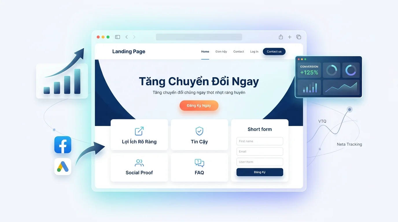
Mainoskelpoinen laskeutumissivu koostuu:
- Hero
- Tarjous
- Luottamus
- Sosiaalinen todiste
- UKK
- CTA
- Kiitossivuprosessi
| Osio | Rooli |
|---|---|
| Hero | Houkutteleva |
| Tarjous | Selittää arvon |
| Luottamus | Rakentaa luottamusta |
| Sosiaalinen todiste | Todistaa |
| UKK | Käsittelee huolenaiheita |
| CTA | Edistää toimintaa |
| Kiitos | Hoitaa liidiä |
Muuta juuri lukemasi todellisiksi tuloksiksi – sovella GTG CRM:ää nyt, ilmaiseksi.
Sovella nyt