Landing Page Chuẩn Ads For Selgere Needs What To Increase Conversion?
You pour several million daily into Facebook Ads. Clicks are there, but no orders. Customers visit the page, scroll for a few seconds, then leave. The problem isn't with the ads – the problem is with the page you're directing customers to.
Landing page – also known as an ad landing page – is where the money you spend on ads will either generate results or not. A good landing page can turn 5 out of 100 clickers into customers. A bad landing page will bring only 1 stray lead from 100 clicks.
So, what does a standard ad landing page for sellers need? This article will go through each section of the page – from the first headline to the last button – so you know exactly what to do if you want to truly increase conversions.
The First 5 Seconds: The Hero Section Decides Everything
When someone clicks on your ad, they have an expectation. Whatever the ad promises, they want to see exactly that on the landing page. If they don't realize they're in the right place within the first 5 seconds, they'll hit the back button.
This is why the hero section – the first part displayed on the screen – is more important than any other section on the page.
An effective hero section needs three things:
- A headline that clearly states the benefit
- A sub-headline that briefly explains
- A clear CTA button
The headline doesn't need to be clever, it needs to be accurate. Don't write "Comprehensive Sales Solution", it's too general, anyone can say that. Write more specifically:
"Triple your ad orders, no need to increase budget"
There's a principle called message match: the content on the landing page must match the ad that leads to it. If the ad says "Reduce cost per lead by 50%", the landing page must also talk about reducing lead costs.
And don't forget: the hero section should have a CTA button right there. About 5-10% of visitors are ready to take action from the beginning.
Presenting Value: Tell Customers What They Get
After the hero section, customers will ask themselves: "Specifically, how does this help me?"
This is where you need to clearly present the value. But don't start with features, start with pain points.
Common issues for sellers running ads:
- Customers enter then leave
- Cannot measure traffic sources
- Form too long → abandoned
- Have leads but don't nurture → leads go cold
When you speak to their pain, customers will nod.
Then, provide the corresponding solutions:
| Problem | Solution |
|---|---|
| Customers leave | Mobile-optimized landing page |
| Cannot measure effectiveness | UTM tracking + real-time dashboard |
| Long form | Smart form with hidden/visible fields |
| Cold leads | CRM + automation follow-up |
Don't list features like a spec sheet — tell a story.
👉 Tip: use real screenshots instead of stock photos.
Build Trust Right on the Page
Sellers are very sensitive to money. They need proof.
The Trust section needs to answer:
"Who is using this? Is it trustworthy?"
How to do it:
- Customer logos (6-10 logos)
- Specific numbers:
- Number of sellers using it
- Number of leads collected
- % conversion increase
- Security badges:
- SSL
- GDPR
- "Data is encrypted"
Social Proof: Let Customers Speak for You
What others say is always stronger than what you say.
❌ Bad:
"Great service!"
✅ Good:
"Before using, CVR was 1.2%. After using the landing page + CRM, it increased to 4.1% – reducing CPL by nearly 3 times."
A good testimonial needs:
- Context (before)
- Action (what was done)
- Result (numerical outcome)
FAQ: The Place to Handle All Final Obstacles
FAQs are not just for show. This is where you handle objections.
Common questions:
- Can I use it if I don't know how to code?
- Does it integrate with Facebook Pixel?
- How much does it cost?
- Is the data secure?
Principles for writing FAQs:
- Put difficult questions first
- Answers should provide benefits
- Short (3-4 lines)
Example:
Does it support Facebook Pixel? → Yes. You can add it directly and know exactly which ads generate leads.
CTA: Small Button, Big Impact
CTA is not:
- "Submit"
- "Send"
Good CTA = Action + Benefit
Examples:
- "Create a standard ad landing page — Free"
- "Receive consultation within 24 hours"
Below the CTA, there should be microcopy:
- No credit card required
- Setup in 5 minutes
- No spam
Can increase conversion by 10-15%
The 3 CTA Rule:
- Hero
- Mid-page
- Bottom of page
Form: Fewer Fields, More Leads
Each field = 5-10% decrease in conversion.
Optimized form:
- Name
- Phone number
- Size
❌ Do not ask for:
- Address
- Date of birth
- Job title
Best practices:
- Label above field
- Placeholder with example
- Real-time validation
- No complex CAPTCHA
Add: Information is absolutely secure
After Submission: Don't Stop at "Thank You"
Common mistake:
"Thank you" → end.
Standard CRO:
1. Dedicated Thank-you page
- Use for tracking (Pixel, Google Ads)
2. Next steps guidance
"An expert will contact you within 2 hours"
3. Keep customers in the ecosystem
- Case studies
- Demo videos
- Fanpage
4. Email within 1 minute
- Confirmation
- Summary of value
- Documents
5. Live chat
"Do you have any questions?"
👉 The hottest leads are right after submission.
Conclusion
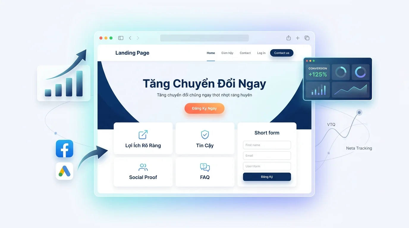
A standard landing page consists of:
- Hero
- Offer
- Trust
- Social Proof
- FAQ
- CTA
- Thank-you flow
| Section | Role |
|---|---|
| Hero | Attract |
| Offer | Explain value |
| Trust | Build confidence |
| Social proof | Prove |
| FAQ | Handle concerns |
| CTA | Prompt action |
| Thank-you | Nurture leads |
Turn what you just read into real results — apply now with GTG CRM, for free.
Apply now