7 most successful Landing Page optimization case studies
Scholar
532 views
Table of Contents
In the age of digital marketing, landing pages are the "first touchpoint" between customers and brands. They are not only a place to introduce products, but also a tool for measuring, optimizing, and directly converting visitors into potential customers. According to HubSpot, the average conversion rate of landing pages globally is 5.89%, while many businesses achieve over 10% through optimized content and user experience.
This article compiles 7 of the most successful case studies on using landing pages, analyzing how well-known brands have increased conversion rates many times over, and drawing lessons for small and medium-sized businesses.
What is a landing page?
A landing page is a standalone webpage designed with a single goal: conversion, such as filling out a form, placing an order, signing up for an offer, or downloading a document.
Unlike traditional websites (with multiple pages and multiple purposes), landing pages focus entirely on a specific action.
An effective landing page typically has:
- An engaging title that clearly states the main benefits.
- Images or videos that clearly illustrate the point.
- Featured Call to Action (CTA)
- The registration or purchase form is simple and has few steps.
See also: SEO-Optimized Landing Pages: The Key to Growth and Winning Over Both Google and Customers
7 Outstanding Case Studies on Landing Page Optimization
1. AvidXchange - Reduced Cost Per Lead by 79% Through Optimized CTAs
AvidXchange, a SaaS platform for payment automation, found that their landing page was attracting many untargeted customers.
They completely changed the content and visuals to focus on the B2B group, and also conducted A/B testing of the CTAs between "Download document" and "Sign up for a 5-minute chat".
Results: Short, conversational CTAs outperformed previous campaigns, reducing costs per lead by 79% and significantly increasing conversion rates.
Lesson learned: The more specific and user-friendly the call to action (CTA), the higher the conversion rate.
2. Artur Jabłoński - Simplify Content, Increase Engagement
This renowned Polish marketer cut out 60% of unnecessary content, keeping only a single message and call to action (CTA). After experimenting with layout and button colors, click-through rates increased by over 30%.
Lesson learned: Simplify the user journey, avoiding overwhelming them with too many options.
3. 1-800-DENTIST - Just enter the ZIP code in one box.
The company's registration page used to require three steps (ZIP, needs, insurance), causing many people to drop out midway.
They shortened it to a single ZIP code at the beginning, moving the remaining two steps to the end.
Result: The form completion rate increased by 23% in just one week.
Lesson learned: Make it easy for customers to get started; don't pressure them to answer too many questions at once.
4. Good.co - New UX Design, Enhanced User Experience
Good.co redesigned its landing page with an intuitive style, bright colors, and a clear call to action (CTA). The user-friendly interface encourages users to stay on the page longer and significantly increases sign-up rates.
Lesson learned: UX/UI is not just about aesthetics, but about tools to increase conversions.
5. ClickMechanic - Optimized Based on Real-World Feedback
By using Hotjar to gather user feedback, they discovered that customers were confused by unclear pricing. The page was redesigned with a clear price list and transparent service information, significantly increasing conversion rates and reducing bounce rates.
Lesson learned: Listen to user behavior data to optimize your content.
6. NeuroMD - Increased Conversion Rates by 55% Through Diverse Testing
This medical device startup partnered with SplitBase to create multiple versions of their landing page (listicle, advertorial, hero style). AI analysis helped them choose the most effective version, resulting in a 55.3% increase in conversions.
Lesson learned: Don't be afraid to experiment with variety; AI and data will guide you in the right direction.
7. firstSTREET - 3,566% Conversion Increase After Redesign
The previous website selling computers to seniors had a cumbersome design, small font, and many steps.
After a complete redesign towards a modern and simple style, conversions increased by 3,566% - a spectacular figure.
Lesson learned: Sometimes it's not about optimizing individual parts, but about redesigning the entire thing to better suit the user.
General Lessons for Businesses
From the seven case studies above, three core principles can be derived:
- Always A/B test - don't assume anything is true until you have the data.
- Focus on the user - what they want, what they understand, and where they encounter difficulties.
- Minimalist but clear - each page should have only one purpose.
GTG CRM - A Simple Landing Page Creation Solution for Vietnamese Businesses
While other brands use their own platforms to optimize landing pages, GTG CRM offers an all-in-one tool, especially suitable for small and medium-sized enterprises (SMEs) in Vietnam:
1. Landing Page Builder with AI support
Create sales or product pages with simple drag-and-drop functionality. Choose from pre-designed templates, and AI will automatically generate content and suggest SEO-optimized images suitable for your products.

GTG CRM's AI helps you create custom images to add to your landing page.
2. Integrate Forms, Chat & Zalo/Messenger
All registration forms are automatically saved to the CRM, and you can reply via Facebook, Zalo, Gmail, or SMS, all within a single interface.
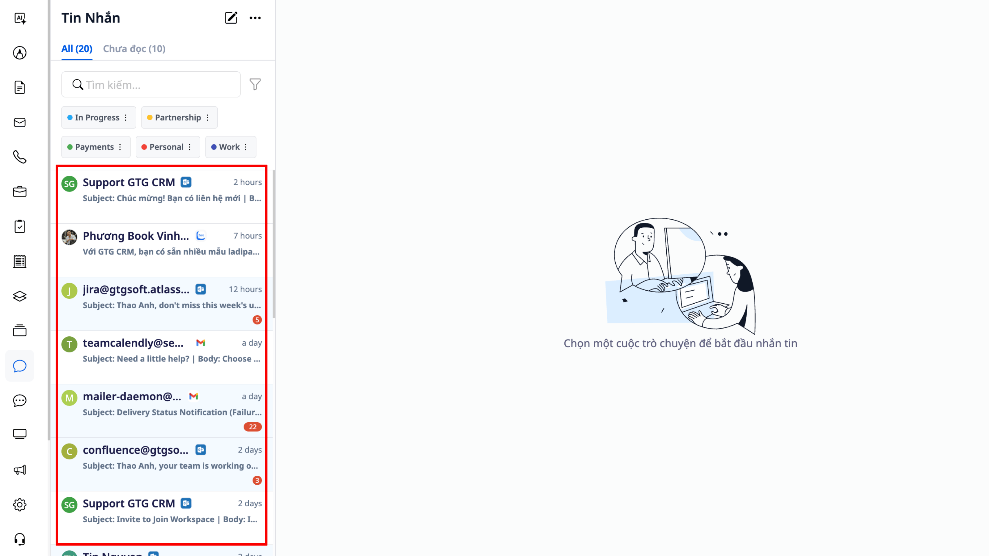
Receive messages from Zalo, Gmail, Facebook, Outlook, and more on a single platform.
3. Automation (Workflow)
When a customer fills out the form → the system sends a thank-you email → adds them to the list of potential customers → suggests follow-up after 3 days.
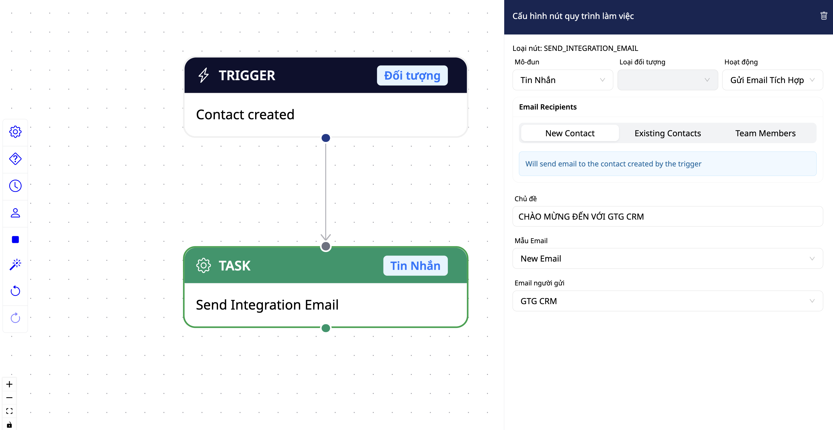
Create a workflow to automatically send thank-you emails when you acquire a new customer.
4. Performance Reporting & Measurement
By integrating landing pages with advertising campaigns on GTG CRM, you can track visits, conversion rates, and more, all displayed visually on your dashboard.
View demos of GTG CRM landing page templates.
Conclude
These 7 success stories demonstrate that landing pages are a "silent weapon" that helps businesses optimize advertising costs and increase conversion rates. But to do it well, you don't need a technical team – just a smart and easy-to-use tool like GTG CRM. From idea → landing page → lead generation → customer care → reporting – everything happens on a single platform.
Maybe You Should Read These

La Ve Gourmet, Mam Spa, Gori Vietnam x3 revenue thanks to Landing Page
Case Study: Airbnb Increases Conversions by 30% with Experience-Optimized Landing Page
Case Study: HubSpot - When Landing Pages and Email Nurture Combine into a Conversion Machine
Year-End Marketing & Sales Strategy and the Role of GTG CRM in Boosting Revenue
Case Study: Headway - Leveraging AI to Breakthrough EdTech Advertising to Breakthrough ROI
Coolmate - Vietnamese Startup Breaks Through Revenue Thanks to CRM and Automation
Revealing How to Optimize Online Business Process for Household Appliance Shop Owners

CASE STUDY: Increase Conversion Rate and Optimize Advertising Costs for A-Style Fashion Chain thanks to GTG CRM
Case Study: Temu - When engagement & personalization are the keys to growth

Optimize Lead Allocation for Sales Course: How GTG CRM's AI Cuts Consulting Time and Costs by 60%
Case Study: Hydrate Medical - Triple Revenue with Systematic Marketing
