What Information Should a Standard Business Website Structure Include?
Insights
GTG CRM Team · GTG CRM
April 22, 2026

Table of Contents
What Sections Should a Standard Business Website Structure Include?
You've decided to build a website for your company. You contact a design agency, and they ask: "What pages would you like your website to have?" but you don't know how to answer correctly.
Or perhaps you already have a website, but visitors browse for a moment and then leave. No one contacts you, no one reads everything. You suspect something is missing from the website, but you don't know what it is.
This is the most common problem for small and medium-sized businesses when building a website: not knowing what sections a standard structure requires. The result is a website that either lacks important pages, has too many pages no one reads, or has a disorganized layout that prevents customers from finding the information they need.
This article will go through each page, each section with sample sitemaps, sample menus, and sample sections so you know exactly what a standard business website needs to have.
8 Essential Pages for a Business Website
Before diving into the details, here is the complete structure that an SMB business website needs:
| Page | Role for Customers | Role for SEO |
|---|---|---|
| Homepage | First point of contact, guides the entire journey | Highest authority, distributes link juice |
| About Us | Builds trust, lets customers know who you are | E-E-A-T signal, brand keyword |
| Services / Products | Where customers understand what you sell and what problems you solve | Targets commercial keywords, conversion |
| Case Studies | Demonstrates capability with real results | Social proof, long-tail keywords |
| Blog | Provides knowledge, nurtures potential customers | Informational traffic, internal links |
| FAQ | Answers questions, overcomes purchase barriers | Featured snippet, FAQ schema |
| Contact Us | Enables customers to take action (call, send form, visit office) | Local SEO, NAP consistency |
| CTA / Landing Page | Captures leads, drives specific actions | Conversion tracking, remarketing |
Each page does not exist in isolation. They are linked together as a system – miss one link, and the customer will drop out of the buying journey.
Sample Sitemap for an SMB Business Website
Before we delve into each page, let's look at the overall picture. Here is a sample sitemap that most small and medium-sized businesses can apply immediately:
Homepage
├── About Us
│   ├── Team (optional)
│   └── Core Values (optional)
├── Services
│   ├── Website Design
│   ├── SEO
│   └── Fanpage Management
├── Projects (Case Studies)
│   ├── Case Study 1
│   └── Case Study 2
├── Blog
│   ├── Article 1
│   └── Article 2
├── FAQ
├── Contact Us
└── Pricing (CTA Landing Page)
Each page is a maximum of 2-3 clicks away from the homepage – this is an important principle for Google to crawl effectively and for customers not to get lost.
Sample Menu: Standard Navigation for a Business Website
The main menu (header navigation) should include a maximum of 6-7 items. More is cluttered, less is insufficient.
Sample Menu:
Home | About Us | Services ▾ | Projects | Blog | FAQ | Contact Us
                          ├── Website Design
                          ├── SEO
                          └── Fanpage Management
Some principles:
- Services should have a dropdown listing individual sub-services.
- CTAs (like "Get a Quote" or "Free Consultation") should be prominent buttons in the right corner, with a different color from other items.
- The menu must work well on mobile – as a hamburger menu, tap to open dropdowns, without obscuring content.
❌ Common mistake: Putting too many items in the menu, making customers unsure where to click first. ✅ Correct: 6–7 main items + 1 prominent CTA button.
1. Homepage - The Hub of the Entire Website
The homepage is not where you tell everything. The homepage is where you guide customers in the right direction – within the first few seconds.
A first-time visitor to your website will ask themselves three questions:
- What does this company do?
- Can it solve my problem?
- What is the next step?
If the homepage answers these three questions in the first 5 seconds, you've won half the battle.
Sample Sections for the Homepage:
Hero Section
- Clear Headline: states what you do and for whom.
- Sub-headline: adds specific benefits.
- Primary CTA Button: "Free Consultation" or "View Services".
- Illustrative image or short video.
❌ "Welcome to ABC Company" ✅ "Professional Website Design for Small and Medium Businesses - From Zero to Online in 2 Weeks"
Featured Services Section (3-4 services)
- Icon + Service Name + 1-2 line description.
- Link to the detailed service page.
Social Proof Section
- 3-5 standout numbers: number of clients, years of experience, projects completed.
- Logos of partners / clients (6–10 logos).
Case Study Section
- 2-3 brief case studies: client name + results achieved.
- Link to the detailed case study page.
Latest Blog Section
- 3 most recent articles.
- Link to the blog page.
End-of-Page CTA Section
- Action Headline: "Ready to Upgrade Your Business Website?"
- CTA Button: "Get a Free Consultation".
- Microcopy: "Response within 24h · No commitment · Free".
2. About Us Page - Building Trust Before Selling
Don't underestimate the About Us page. This is one of the most visited pages on a business website – especially for B2B clients in the consideration stage.
Customers visit the About Us page because they want to answer:
"Is this company trustworthy? Do they have the capability?"
So, what does the About Us page need?
Sample Sections for the About Us Page:
Company Story
- Don't write it like "established in 20XX, with a mission to...". Tell a short story with a problem and how you solve it.
- Example: "We started because we saw that 80% of SMB websites in Vietnam looked the same, and no one wanted to revisit them a second time."
Vision and Core Values
- 3-4 core values, each with a 1-2 line specific explanation.
- Avoid generic words like "professional," "dedicated," "creative" – everyone says that.
Team
- Real photos, names, titles, and a 1-line description of expertise.
- You don't need the whole company; 3-5 key people are enough.
Achievements in Numbers
- Years in operation.
- Number of clients served.
- Number of projects completed.
Certifications / Partners
- Logos of strategic partners.
- Industry certifications (if any).
👉 Tip: The About Us page should have a CTA at the end – e.g., "Want to know how we can help your business? → Contact Us Now."
3. Services Page - Where Customers Decide Whether to Contact You
The Services page is where customers specifically understand what you offer, what your process is like, and why they should choose you over competitors.
The most common mistake: grouping all services on a single page, writing only 2-3 lines for each service. Customers don't understand clearly after reading, and Google doesn't know what keywords this page targets.
The correct way: create 1 overview page + 1 detailed page for each service.
Services Overview Page ( /services ):
- List all services in a card format: icon + name + short description + link to details.
- Each card leads to a separate service page.
Detailed Service Page ( /services/website-design ):
Sample Sections:
| Section | Content |
|---|---|
| Hero | Service name + main benefit description + CTA |
| Problems | 3-4 pain points that customers are experiencing |
| Solutions | How you solve each problem |
| Process | 4-6 steps from contact to delivery |
| Comparison Table | Comparison of service packages or against competitors (optional) |
| Case Studies | 1-2 case studies related to this service |
| Specific FAQ | 4-6 questions related to the specific service |
| CTA | "Get a Quote for Website Design Service" |
👉 Each detailed service page targets a specific commercial keyword. For example: "business website design," "SEO services for SMBs."
4. Case Study Page - Let Results Speak for You
SMB customers are very cautious when spending money. They need proof that you've done it before, not just talked about it.
The Case Study page (or Projects page) is where you showcase that proof.
Structure of an Effective Case Study:
1. Client Background
- Industry, size, and the problems they were facing.
2. Specific Challenges
- Example: "The old website loaded in over 8 seconds, had a 75% bounce rate, and no functional contact form."
3. Solution Implemented
- What you did – list specifically, step-by-step.
4. Results in Numbers
| Metric | Before | After |
|---|---|---|
| Load Time | 8.2s | 2.1s |
| Bounce Rate | 75% | 42% |
| Leads / month | 5 | 28 |
5. Client Testimonial
"After redesigning the website, leads increased fivefold within the first three months." - Mr. Minh, Director of ABC Corp.
On the main Projects page ( /projects ), display a list of case studies in card format: thumbnail image + client name + key result + link to details.
5. Blog Page - The Machine for Generating Traffic and Nurturing Customers
The blog is not for writing just for the sake of it. The blog is a tool to:
- Attract traffic from Google – through articles targeting informational keywords.
- Build expertise – so customers believe you truly understand the industry.
- Nurture potential customers – from "learning" to "ready to buy."
- Create internal links – guiding customers from blog posts to service pages and case study pages.
What Does a Blog Need to Be Effective?
Structural aspects:
- Blog listing page ( /blog ) – displays the latest articles, with pagination.
- Detailed article page ( /blog/article-slug ) – has a table of contents, breadcrumbs, and a sidebar suggesting related articles.
- Categorize by category or tag.
Content aspects for each article:
| Section | Description |
|---|---|
| H1 Title | Contains the main keyword, under 70 characters. |
| Opening Paragraph | States the problem + promises value, within 3-4 lines. |
| Main Content | Divided into clear H2/H3 headings, each section answers one question. |
| Images / Tables | Illustrate with real images, data tables, or specific examples. |
| In-Article CTA | 1-2 CTAs leading to related services or landing pages. |
| Conclusion | Summary + final CTA. |
👉 Tip: Each blog post should link to at least 2–3 other pages on the website (service pages, case studies, or related blog posts). This is how to build natural internal links.
6. FAQ Page - Addressing All Barriers Before Customers Contact You
FAQ is not a secondary page. This is where you proactively address concerns that customers have but don't ask – and because they are not answered, they silently leave.
Questions that a business website FAQ should include:
About Services:
- What is the workflow like?
- How long does it take to complete?
- Is there support after delivery?
About Costs:
- What is the approximate cost?
- Are there packages for small businesses?
- How do payments work?
About Technical Aspects:
- I'm not tech-savvy, can I still work with you?
- Can the website content be self-edited after delivery?
- Is my data kept confidential?
About Reliability:
- How long has the company been in operation?
- Are there any clients I can refer to?
Principles for Writing FAQs:
- Put difficult questions first: questions about price, time, risks.
- Answers should highlight benefits: don't just answer "yes/no".
- Keep it concise: 3-5 lines per answer.
Example:
I don't know how to code, can I manage the website myself? Absolutely. The website uses an intuitive Content Management System (CMS) – you only need to know how to use Word to update content, add posts, or change images without touching any code.
👉 For SEO: use FAQ Schema markup so questions can appear as rich snippets on Google – taking up more space on the search results page.
7. Contact Us Page - Don't Make Customers Hunt for Contact Information
It sounds simple, but many business websites have incomplete contact pages, or just a mail form that no one replies to.
A Standard Contact Us Page Needs:
| Component | Details |
|---|---|
| Contact Form | Name, email, phone number, message (4 fields are sufficient) |
| Phone Number | Main hotline, clickable (click-to-call on mobile) |
| Professional email (use company domain, not Gmail) | |
| Address | Office address + embedded Google Map |
| Operating Hours | Monday - Friday, 8:00 AM - 5:30 PM (or as applicable) |
| Other Channels | Zalo, Messenger, or live chat (depending on the industry) |
Principles for Contact Forms:
- Fewer fields = more leads. Each added field reduces the form completion rate by 5-10%.
- Clear labels, placeholder with examples (e.g., "John Doe").
- Real-time validation – report errors immediately upon incorrect input, don't wait until submission.
- Below the form, there should be a line: Your information is kept strictly confidential.
For SEO: ensure NAP (Name - Address - Phone) on the contact page exactly matches the information on your Google Business Profile. This is an important signal for Local SEO.
8. Consistent CTAs - Small Buttons, Big Impact
CTAs (Call-to-Actions) are not a separate page – they are a consistent element across all pages of the website.
A standard business website needs CTAs in the following positions:
| Position | CTA Type | Example |
|---|---|---|
| Header (Menu) | Prominent Button | "Free Consultation" |
| Hero Section (Homepage) | Primary CTA | "View Services" or "Get a Quote" |
| End of each service page | Conversion CTA | "Get a Quote for [Service Name] Service" |
| Within blog posts | Contextual CTA | "Learn more about [related service]" |
| Footer | Secondary CTA | "Subscribe to Newsletter" |
| Popup / Slide-in | Lead capture CTA | "Download Free Guide" (optional) |
Principles for Writing CTAs:
A good CTA = Action + Benefit
❌ "Send" ❌ "Submit" ✅ "Receive Free Consultation within 24h" ✅ "View Detailed Pricing"
Below each CTA, there should be microcopy to alleviate concerns:
- No commitment
- Response within 24h
- Completely free
Structure Design Rule: Consistent Brand Identity
A good website structure is not just about having enough pages – it's about consistency across all pages. This is where brand identity plays an important role.
Elements that need to be consistent throughout:
- Colors: maximum of 2-3 main colors, used consistently for CTAs, headings, and links.
- Fonts: 1 font for headings, 1 font for body – don't use more than 2 fonts.
- Tone of Voice: if the homepage is written in a friendly tone, the services page should also be friendly; don't suddenly switch to a corporate voice.
- Images: prioritize real photos; if using illustrations, use them in a consistent style throughout.
- Header and Footer: should be the same on every page – this is the framework of the website.
When brand identity is consistent, customers perceive professionalism without you having to say it.
Conclusion
A standard business website doesn't need dozens of complex pages. It needs exactly 8 pages, each fulfilling its specific role:
- Homepage: guidance
- About Us: building trust
- Services: explaining value
- Case Studies: proving capability
- Blog: attracting and nurturing
- FAQ: overcoming barriers
- Contact Us: driving action
- Consistent CTAs: promoting conversion
Clear structure, content in the right place, consistent brand identity – this is the formula for your business website to not just "exist," but to truly generate customers.
Turn what you just read into real results — apply it now with GTG CRM, for free.
Apply NowMaybe You Should Read These
7 Most Successful Landing Page Optimization Case Studies

Là Vè Gourmet, Mầm Spa, Gori Vietnam Triple Revenue with Landing Pages
From Toys "R" Us's Failure to the Transformation Path for Traditional Businesses in the Digital Age
Case Study: HubSpot - When Landing Pages and Email Nurture Combine into a Conversion Machine
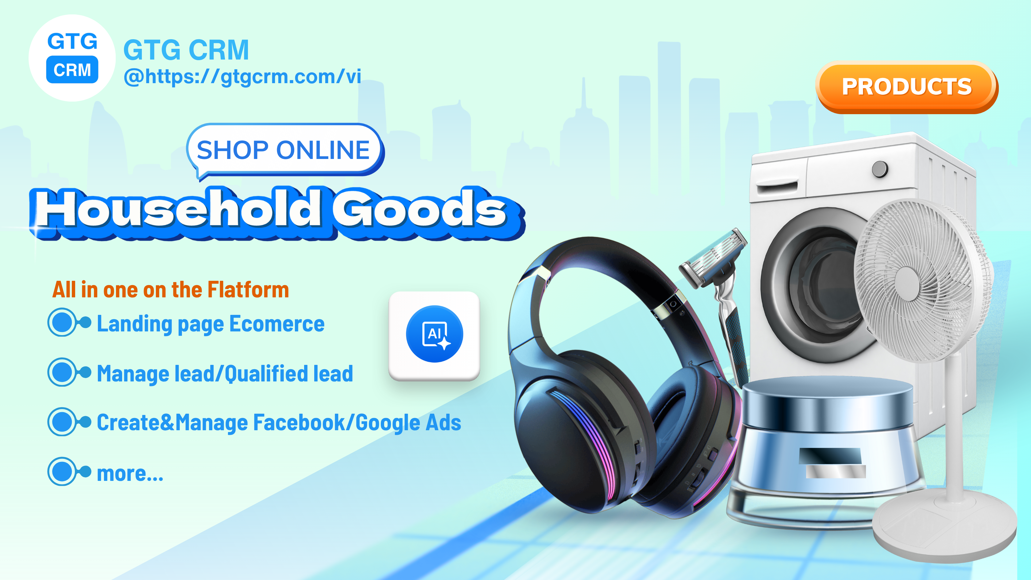
Unlock Ways to Optimize Online Business Processes for Home Goods Shop Owners
Case Study: Airbnb boosts conversion by 30% with an optimized landing page experience
Case Study: Temu - When Engagement & Personalization are Key to Growth
Case Study: Hydrate Medical - Tripled Revenue with a Systematic Marketing Approach

Year-End Marketing & Sales Strategies and the Role of GTG CRM in Accelerating Revenue

Coolmate - Vietnamese Startup Achieves Revenue Breakthrough with CRM and Automation
Thien Nam Hoa Electronics Supermarket - Applying CRM to Accelerate Retail