How to Build a Clear Online Store Website: Easy to Find – Easy to Understand – Easy to Buy
E-commerce Website
GTG CRM Team · GTG CRM
April 22, 2026

Table of Contents
You're an e-commerce seller with over 500 products on Shopee, Lazada, and TikTok Shop. Your revenue is stable at 50-100 million VND per month. But one day a customer asks, "Does your shop have a website?" – all you can do is give them a Shopee link, or a website link that they visit and then... close immediately.
Why? Because the website is messy:
- Over 500 products without categories → customers don't know what to look for.
- The menu is messy → you have to click 5 times to find the product.
- Product images are blurry and load slowly → customers close the page after 3 seconds.
The result? You're still 100% dependent on the e-commerce platform:
- 📉 Commission fee of 15-25% per order
- 📉 Algorithm changes → traffic drops suddenly
- 📉 Failure to build a unique brand → customers only remember "bought on Shopee" but not the shop's name.
This article will guide you in building an e-commerce website using the "easy to find – easy to understand – easy to buy" formula – helping customers find products in 10 seconds, understand their value in 30 seconds, and checkout in 2 minutes. No coding knowledge required, just drag and drop.
🔥 Why do sellers with multiple products NEED their own website?
1. Reduce dependence on e-commerce platforms.
E-commerce platforms can:
- Commission fees can be increased at any time (Shopee once increased them from 3% to 5-10% in just a few months).
- Changes to the algorithm → your product will be pushed down the ranking.
- Not giving you ownership of customer data → inability to provide customer care/retargeting.
Website = private property. You own 100% of the data, no one can forbid advertising, and no one can charge commission fees.
2. Increase order value
On e-commerce platforms, customers view your product → the algorithm suggests a competitor's product right next to it. You lose customers.
On their own website:
- Free cross-sell/upsell : Customer buys serum → you suggest adding toner, moisturizer
- Bundle products : Combo of 3 products with a 15% discount → increases the order value.
- Avoid competing with other sellers on the same page → customers focus 100% on your product.
3. Build a long-term brand.
- A custom domain (e.g.,
myphamxinh.vn) → customers remember your name, not just "a cosmetics shop on Shopee". - Organic SEO → Free traffic from Google forever (unlike paid advertising from e-commerce platforms).
- Retargeting via Facebook Pixel → Customers view products but don't buy? Run reminder ads targeting only this group → low cost, high conversion
🔥 Action: List 3 reasons why YOU need your own website right now – write them down on paper or in notes on your phone.
🗂️ Information architecture for an e-commerce website (Standard menu)
A sales website is like a physical store: customers need to know "where to go" to find the products .
Standard menu diagram:
📌 Trang chủ ├── 🛍️ Danh mục sản phẩm │ ├── Danh mục A (VD: Áo thun nam) │ ├── Danh mục B (VD: Quần jeans) │ ├── Danh mục C (VD: Phụ kiện) │ └── 🔥 Khuyến mãi / Sale ├── ℹ️ Về chúng tôi ├── 📝 Blog │ ├── Hướng dẫn sử dụng │ ├── Review sản phẩm │ └── Tips & Tricks ├── 📞 Liên hệ ├── ❓ FAQ ├── 📜 Chính sách │ ├── Đổi trả │ ├── Vận chuyển │ └── Bảo mật thanh toán └── 🛒 Giỏ hàng / CheckoutPrinciples of category classification:
| Principle | Explain | Incorrect example | Correct example |
|---|---|---|---|
| Rule 7±2 | Maximum 5-9 level 1 categories (the human brain can only remember 7±2 items at a time) | 15 categories → customers are shocked | 6 categories: Shirts, Pants, Skirts, Accessories, Sale, Blog |
| Category names contain keywords. | Category names must be clear and include SEO keywords. | "Collection 1", "Collection A" | "Men's T-shirt", "Skin serum" |
| Sort by needs | Bestseller, Pre-order Sale | The product that's not selling well is placed at the top. | Sale/Bestseller is placed at the top of the menu. |
🔥 Action: Draw a menu diagram for YOUR website – up to 7 level 1 categories. Use clear names with keywords.
🏗️ Designing each page of the e-commerce website (Details)
Each page on the website has a specific role – much like each area in a physical store.
1. HOME PAGE — "Storefront Shops"
Objective: Make a strong impression in the first 3 seconds + provide quick navigation to categories/products.
The following sections are required:
| Section | Role | GTG CRM Component |
|---|---|---|
| Hero Banner | Convey the main message: Sale, new product, USP | HeroSectionCenter , HeroProductBanner , PromoHero , CountdownTimer |
| Featured Products | Display 4-8 featured/bestselling products | FeaturedProducts |
| Category Carousel | Quickly browse the main categories. | CategoryCarousel |
| Testimonials | Customer reviews → increased trust | TestimonialQuote |
| Brand Carousel | Brand logo, distribution, new collection | BrandCarousel , CollectionGrid |
Here's a real-world example:
Cosmetics shop:
- Hero Banner: "30% off all serums – 3 days left" + countdown timer
- Featured Products: 6 bestselling products (vitamin C serum, sunscreen, toner)
- Category Carousel: Serum, Moisturizer, Toner, Mask
- Testimonials: "My skin has brightened noticeably after 2 weeks of using this serum" – Nguyen Anh, Hanoi
Common mistakes:
- ❌ Hero banners lack clear call-to-action (CTA) → customers don't know what to do next.
- ❌ Displaying too many products (>12) on the homepage overwhelms customers, making it difficult for them to choose.
- ✅ Edit: 4-8 featured products + "See more" button leading to the category
🔥 Action: Select 6 of your bestselling products → These will be featured as Featured Products on the homepage.
2. CATEGORY PAGE — "Organized Shelves"
Objective: To help customers filter and find products quickly among 500+ SKUs.
The necessary components are:
| Ingredient | Role | GTG CRM Component |
|---|---|---|
| Product Grid | Displays products in a grid format, easy to scan. | ProductListPage (with built-in filter) |
| Filter sidebar | Filter by price, color, size, brand | ProductListPage (filter) |
| Featured sidebar | Featured products alongside the list | FeaturedProductsWithSidebar |
| Breadcrumbs | Navigate to "Home > Shirts > Men's T-shirts" | Breadcrumb element |
Here's a real-world example:
Fashion shop:
- Breadcrumb: Homepage > Shirts > Men's T-shirts
- Filter: Price (under 200k, 200-500k, over 500k), Color (Black, White, Blue), Size (S, M, L, XL)
- Product Grid: 24 products per page, with clear images, clearly displayed prices, and discount percentages if available.
Common mistakes:
- ❌ No filters → customers have to scroll through thousands of products
- ❌ Inconsistent product images (some with white backgrounds, some with colored backgrounds) → visually confusing.
- ✅ Edit: Add filters + normalize the image (white background, 1:1 or 3:4 aspect ratio)
🔥 Action: List 3-5 of the most important filter criteria for your product category (price, color, size, brand...).
3. PRODUCT DETAILS PAGE — "Sales Consultant"
Objective: Persuade customers to buy with detailed information and encourage action.
The necessary components are:
| Ingredient | Role | GTG CRM Component |
|---|---|---|
| Multi-angle photo gallery | Customers view the product from all angles. | ProductDetail page |
| Original price + Sale price + Discount percentage | Create the feeling of a "good deal". | ProductDetail (price section) |
| Detailed description + specs | Answer any questions the customer may have. | ProductDetail (description tab) |
| Prominent CTA button | "Add to cart" / "Buy now" | ProductDetail (CTA buttons) |
| Related products | Cross-sell: "Customers who buy this often buy more..." | ProductRecommendationsSection |
Here's a real-world example:
Furniture shop:
- Gallery: 6-8 photos (front view, back view, side view, zoomed-in photos showing material details, photos of the table in the actual space)
- Price: 5,000,000 VND 3,500,000 VND (-30%)
- Description: Dimensions (length x width x height), material (natural oak wood), weight, 2-year warranty.
- CTA: "Add to cart" (bold blue) + "Buy now" (red)
- Related products: Dining chairs (matching set), floor rugs
Common mistakes:
- ❌ Only 1-2 photos → customers won't believe it
- ❌ Product descriptions copied/pasted from e-commerce platforms → lack emotion and are unconvincing.
- ❌ No specs → customers have to inbox to ask → missed conversions
- ✅ Edit: 6-8 high-quality photos + detailed description (size, material, usage instructions)
🔥 Action: Choose one bestselling product → take 5-8 more detailed photos (if you don't already have them) + write a detailed description of 200-300 words.
4. SHOPPING CART & CHECKOUT — "Cash Register"
Objective: Reduce the cart abandonment rate from 70% to <50%.
The necessary components are:
| Ingredient | Role | GTG CRM Component |
|---|---|---|
| Cart summary | Clearly display the product, quantity, price, and total amount. | Cart section |
| Simple checkout form | Only ask for necessary information: Name, Phone Number, Address | CheckoutAddress section |
| Trust badges | Security icon, free returns → increases trust | TrustBadges element |
| Final Upsell | "Add 200k for free shipping" or "Buy X more to get a 10% discount" | Custom banner |
Here's a real-world example:
Standard checkout form:
- Customer information: Full name, phone number, email (optional)
- Delivery address: Address, District/County, Province/City
- Payment methods: Cash on Delivery / Bank Transfer / E-wallet
- Avoid unnecessary questions: Don't ask about date of birth, gender, occupation, etc. → customers will abandon their cart.
Common mistakes:
- ❌ Checkout form is too long (>10 fields) → 70%+ of customers abandon their cart.
- ❌ No shipping fee displayed before checkout → customers are shocked when they see the final total.
- ❌ No trust badges → customers worry, "Is this a scam?"
- ✅ Edit: Checkout 5-7 fields, display shipping fee immediately upon address selection, add icons for "Secure Payment" and "7-Day Returns".
🔥 Action: Test checkout on your website → count the number of steps and fields to fill out. If there are more than 7 fields or more than 3 steps → simplify immediately.
5. TRUST PAGES — Increase trust in online purchases
Objective: To address all customer concerns before they make a purchase.
The following pages are required:
| Page | Role | GTG CRM Component |
|---|---|---|
| FAQ | Frequently Asked Questions: How long does shipping take? How do I return or exchange items? | 5 Accordion FAQ Variations |
| Return and exchange policy | Clear return and exchange process → customers can buy with confidence. | Text page ( TextSection can also be used) |
| Shipping Policy | Shipping fees, delivery time | Text page |
| About us | Brand story + social proof (number of customers, partners) | AboutUs page with testimonials |
Example of a standard FAQ:
- How long does shipping take?
- Hanoi/Ho Chi Minh City (within city limits): 1-2 days
- Distant provinces: 3-5 days
- Can I exchange or return the item?
- Free exchange/return within 7 days if the product is faulty or does not match the description.
- Condition: Still sealed, unused.
- How do I pay?
- COD (cash on delivery)
- Bank transfer
- E-wallets (MoMo, ZaloPay)
🔥 Action: Write down 5-7 of the most common FAQ questions customers ask you → and put them on your FAQ page.
⚠️ 5 common mistakes when building an e-commerce website (and how to fix them)
| Mistake | Consequence | How to fix |
|---|---|---|
| 1. Menu has too many levels (>3 levels) | Customers have to click 5 times to see the product → leave the website. | Limit menu to 2-3 levels: Home > Categories > Products |
| 2. No search bar | 500+ SKUs → customers cannot find the specific product. | Add a prominent search bar to the header, with product suggestions when typing. |
| 3. Poor/Overly explicit product photos | Blurry images → customers don't believe it; Large images → slow website loading → bounce. | Optimize images (WebP format, <200KB/image), lazy loading. |
| 4. Multi-step checkout | Checkout >3 steps → 70%+ of customers abandon their shopping carts | Checkout in 1-2 steps: Information → Confirmation (or One-page checkout) |
| 5. No trust pages | Customers worry about the shop being a scam → they don't dare to buy. | Additional FAQs, Return Policy, About Us, Customer Reviews |
🔥 Action: Check your website → Is it making any of the 5 mistakes above? Fix the easiest one first (e.g., add a search bar, add an FAQ).
🎨 3 e-commerce website templates from GTG CRM (Detailed introduction)
GTG CRM offers 3 professional e-commerce templates, optimized for Vietnamese sellers:
1. Comprehensive E-commerce Template
Suitable for: Sellers in multiple industries (fashion, electronics, household goods, etc.)
Available:
- Homepage with Hero Banner, Featured Products, Category Carousel
- Products page with filters (price, brand, category)
- Cart + Checkout Page (1-2 steps)
- Blog (SEO content writing)
- Contact + FAQ
Advantages: Versatile, easily customizable, suitable for all industries.
2. Cosmetic Store Model
Suitable for: Sellers of cosmetics, skincare, and beauty products.
Available:
- Beautiful photo gallery (displaying products by collection)
- Brand-focused: Highlight the brand and tell a story.
- Blog about beauty tips and skincare routine guides.
Advantages: Elegant design, focus on brand image and story.
3. Furniture Samples
Suitable for: Sellers of high-end furniture, decor, and home appliances.
Available:
- Showroom-style layout (displaying products as in a real showroom)
- Large image, zoomed-in for detailed material texture.
- Smart product recommendations (table + chairs, sofa + coffee table)
Advantages: Creates a "living space" feel → customers can easily visualize the product in their own home.
🔥 Action: View 3 template samples → choose one that suits your industry.
🚀 7-Step Guide to Creating an E-commerce Website (No Coding Required)
Step 1: Register for GTG CRM
- Access: [gtg-crm.com]
- Register an account → Get 36,888 free credits to try out.
Step 2: Choose an e-commerce template suitable for your industry.
- Go to the "Templates" section → choose one of the three templates:
- Integrated (multi-sector) e-commerce
- Cosmetic Store
- Furniture
Step 3: Set up the Brand Kit
- Upload your logo
- Choose your brand colors (main color, secondary color).
- Choose a font (if needed).
GTG CRM will automatically apply the color and logo to the entire website.
Step 4: Add products
- Method 1 (quick): Import from Excel/CSV file (if there are 100 or more products)
- Method 2 (manual): Add each product individually: Name, Price, Image, Description
Each product should have 5-8 photos + a description of 200-300 words.
Step 5: Drag and drop to adjust page content.
- Drag and drop the sections on the homepage:
- Hero Banner → replace image + text "Sale 30%"
- Featured Products → select 6 bestselling products
- Category Carousel → select 4-6 main categories
- Similarly for the About, Contact, FAQ pages, etc.
→ No coding required, just drag and drop + fill in text
Step 6: Install Facebook Pixel + Google Tag
- Facebook Pixel: Retargeting customers who viewed products but didn't buy → run ads specifically for this group.
- Google Tag Manager: Track customer behavior (which pages they view, add items to cart, checkout, etc.)
→ GTG CRM has a 1-click guide to installing Pixel.
Step 7: Configure SEO
- GTG CRM automatically creates:
- Meta title and meta description for each page.
- Sitemap (submitted to Google Search Console)
- SEO-friendly URLs (e.g.,
myphamxinh.vn/serum-vitamin-cinstead of...product?id=123)
→ Simply upload your sitemap to Google Search Console → organic traffic from Google will start coming in after 1-3 months.
🔥 Action: Register for GTG CRM today → follow the 7 steps above → complete your website in 1-2 days.
🎯 Conclusion
A well-designed e-commerce website means easy to find, easy to understand, and easy to buy , resulting in increased revenue.
"Easy to find": Clear 2-3 level menu, prominent search bar, breadcrumb navigation.
"Easy to understand": Clear product images, detailed descriptions, clearly displayed prices, and FAQs that answer all questions.
"Easy to buy": 1-2 step checkout, trust badges, shipping fees displayed upfront, multiple payment methods.
In short:
- Sellers with multiple products need their own website to reduce reliance on marketplaces, increase order value, and build brand awareness.
- Standard menu: 5-9 level 1 categories, names with keywords, sorted according to needs.
- Homepage = "front view", Category = "shelf", Product Page = "sales consultant", Checkout = "cash counter"
- Avoid these 5 mistakes: Multi-level menus, no search function, poor quality images, complicated checkout, and lack of trust pages.
- GTG CRM offers 3 professional e-commerce templates and a 7-step website creation process without coding.
🔥 Next step:
👉 View 3 e-commerce website templates from GTG CRM → Choose the template that suits your industry → Start building your website today.
👉 Sign up for GTG CRM → Receive 36,888 free credits → Create a professional online store in 1-2 days.
No coding knowledge required. No need to hire a developer. Just drag and drop and fill in the content.
Your online store = Your asset. Don't lose customers because of a cluttered website. 🚀
Turn what you've just read into tangible results — apply it now with GTG CRM, free.
Apply nowMaybe You Should Read These
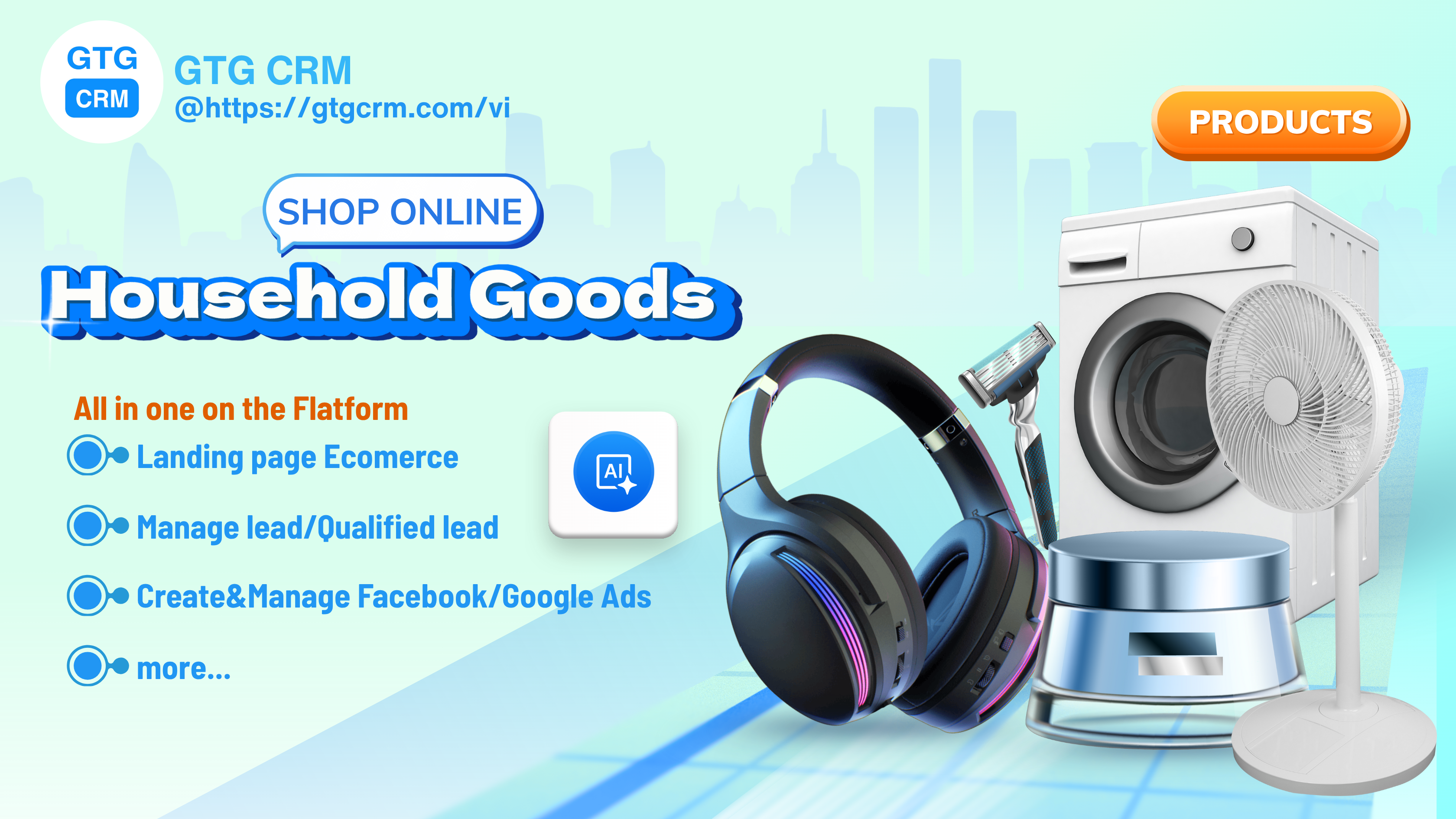
Unlock Ways to Optimize Online Business Processes for Home Goods Shop Owners

7 Most Successful Landing Page Optimization Case Studies
Case Study: Temu - When Engagement & Personalization are Key to Growth

Coolmate - Vietnamese Startup Achieves Revenue Breakthrough with CRM and Automation

Là Vè Gourmet, Mầm Spa, Gori Vietnam Triple Revenue with Landing Pages
Year-End Marketing & Sales Strategies and the Role of GTG CRM in Accelerating Revenue

MM3.vn - Automate Your Entire Content Workflow
Thien Nam Hoa Electronics Supermarket - Applying CRM to Accelerate Retail

Case Study: Ms. Lan Anh - From Multichannel Management Confusion to Effective Sales with GTG CRM
Case Study: HubSpot - When Landing Pages and Email Nurture Combine into a Conversion Machine
From Toys "R" Us's Failure to the Transformation Path for Traditional Businesses in the Digital Age